How Finalyse can help
Combining a technological and practical approach to deliver actuarial and risk modelling solutions
We help you streamline your modelling and reporting workflows
Unlock the future of insurance with our complimentary educational workshop diving deeply into AI and Machine Learning.
Process Automation in Insurance Series #1 : Workflow optimisation with automated process mapping

Introduction
This article marks the start of a series where we explore practical use cases of process automation in insurance from process mapping to auto-generated reports. Finalyse focuses on financial reporting, valuation, risk management and pricing but the same approach can be applied to any other workflow.
Digitalisation is on the top of the agenda for insurers as part of their efforts to improve operational efficiency and transparency via modernisation. Process mapping is the critical foundation of all such initiatives especially when moving away from spreadsheet-based processes. It enables the exploration of key workflow components - inputs, calculation steps and outputs – using visual tools such as flowcharts regardless of the technological environment.
The aim of this article is to explain how process mapping can be accelerated via automation using an open-source toolkit. Finalyse project teams use the same approach to understand the context of their projects and deliver value. Insurers looking to optimise their workflows can benefit from the same methodology due to reduced project timelines, improved accuracy, and user experience.
In the next two sections we show how processes can be mapped manually or accelerated via automation by extracting metadata from spreadsheet-based processes, including a complex web of Excel files widely used in financial reporting.
Finally, we show how advanced technologies can take this a step further. The information underlying the auto-generated process maps can analysed further with process mining to provide additional insights. Generative AI tools turn a spreadsheet-based process into open-source code by the click of a button to enable repeated process runs or sensitivity analysis quickly.
Manual process mapping – the old school way
Definition
Process maps are visual aids that describe the sequence of work for a particular process or procedure. They are helpful tools in financial reporting to clarify the set of tasks that need to be repeated periodically. With robust process mapping in place, teams can function efficiently with heightened levels of accuracy, transparency, and accountability.
A process map should clearly define each task, the sequence of process steps and who is responsible to perform them. They are particularly relevant when a business undergoes a process transformation project. A process map can serve as a starting point to define the steps in the current process and identify areas for improvement.
The visual nature of the process map allows it to be presented at a high level to a wider audience of stakeholders, who may not necessarily have the technical expertise required for each step.
Tools
Several tools are available to create flowcharts, process maps or other visual diagrams, some examples and their key features are included in the table below.
Tools | Key features |
MS Office or Visio | Widely available and cost-effective for Office users Basic charts can be created using shapes in Word or PowerPoint More complex diagramming toolkit with Visio for separate license |
yEd | Free but powerful application that can be used to quickly and effectively |
LucidChart | A cloud-based tool that supports collaboration Limited version available for free |
| In our examples we used yEd and the free version of LucidChart. |
Process mapping example
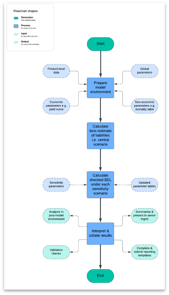
A simple process map describing the Best Estimate Liability (BEL) sensitivity analysis for annuities is shown below created with LucidChart:
Practical considerations
An effective process map should distinguish between the types of steps in the process. In the example above, the inputs, process steps (model set up and calculations) and outputs are shown with different shapes and colours. This makes the process map more visually appealing and easier to follow. Setting standard shapes and colours for each step is good practice to achieve consistency across different process maps in the organisation. Start and end nodes can be particularly useful when merging individual process maps into a wider chain as it enables the user to connect them easily.
The level of detail in a process map can also be tailored to the needs of the audience. The process map shown above highlights the main calculation steps and defines the inputs and outputs associated with each; however, it is low on technical detail. It was prepared for senior stakeholders with non-actuarial background looking for a general overview of the steps involved in the BEL sensitivity analysis. Also, as the process is performed by the same team, no distinction was necessary on who carries out each step in this case.
On the other hand, this may have limited utility for experts with technical expertise (actuaries) running the process. For such an audience it is advisable to increase the level of detail for each step. This may include specifying file paths and names or showing the process steps in more detail making them easy to carry out in production mode and serve as a checklist. This will allow users to go through the process in a methodical manner.
No single process map will meet the requirements of all stakeholders as the visual appeal may be compromised when adding additional layers of detail. At Finalyse, when supporting process mapping, we tailor our solutions and reports to the needs of our clients, stakeholders, and the objective of the project. Diagramming tools provide techniques to tackle this, e.g. by hiding certain details in plain sight as they only appear when hovering over the step in question. Each process document should specify the target audience clearly and the level of detail included should match the needs of the audience.
Challenges of manual process mapping
Process mapping is usually performed manually by investigating all process components and their relationships one by one. This is often time-consuming, prone to human error, and difficult to scale for large, complex workflows. In the next section we show how these challenges can be overcome via automation.
Automated process mapping of spreadsheet-based processes
Automated process mapping simplifies workflows by rapidly identifying relationships and dependencies and enabling scalability for complex processes.
Processes based on spreadsheets (mainly MS Excel) are widely used in financial reporting, planning, or risk management where calculations are performed across multiple worksheets in the result file and using external links to other spreadsheets. Exploring and describing the calculation steps of such a process manually is a time-consuming, error-prone, and iterative process whereby the analyst, reviewer or auditor follows the formulae and links working backwards from the results reported.
However, this process can be automated by utilising metadata via the following steps:

Collecting and exploring metadata on a spreadsheet-based process in step 1 requires going through each cell of the result spreadsheet via program code, analysis of the formulae and detection of links to other worksheets of external files. The level of granularity and aggregation will depend on the use case. Metadata describes the data flows between cells, spreadsheets, and Excel files (workbooks). It includes formulae in cells without regard to the current value of the calculation in the cell.
All steps can be achieved using open-source tools. We used R for step 1 and yEd for steps 2-4 to generate the charts in this section (but Python is a viable alternative for all steps).
Practical example
The auto-generated process map for the BEL calculation of annuities is shown below. It involves annual cash-flow projection and present value calculations for 1,000 annuitants over a period of 60 years. The chart was created without even opening the five spreadsheets involved in the process.
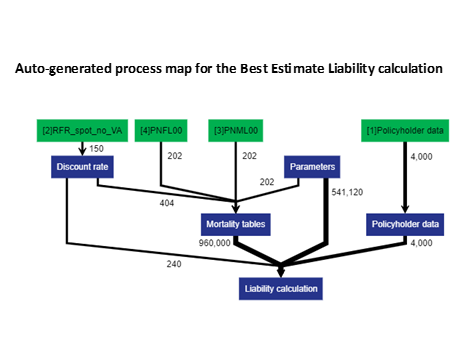
Notes: 1. The blue boxes represent sheets of the Excel result file 2. The green boxes denote other linked Excel files (RFR_sport_no_VA: risk-free EIOPA discount rates, PNML00/PNFL00: UK mortality tables) 3. The number labels on edges show the number of references to the source file. 4. The thickness of the edges is proportional to the number of references.
The diagram shows that even such a simple process involves over 1.5 million formula references to other sheets or files. In a real-world setting this could quickly reach 1.5 billion e.g. with 100 thousand policyholders and 10 sensitivities (i.e. 100 x 10 = 1,000 times vs original base case) resulting in a slow and cumbersome workflow with little added value. Note that all such formula references are prone to error in Excel-based workflows with limited functionality to for debugging. Process mapping exercises often detect such errors even if the objective is only to document the current process for audit, validation, business continuity, or simply as good governance practice, not necessarily process improvement or automation.
The diagram also highlights that the most involved calculations are performed on the Liability calculation tab, with links to the Mortality tables and Parameters. This information can help speed up the process, e.g. by converting it into Python or R code and performing calculation intensive components of the calculation in vectorised manner instead of cell by cell.
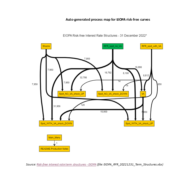
The same process mapping approach was applied on the spreadsheet containing risk-free curves published by EIOPA for 31 December 2022. This file does not have external links, so the focus of the exercise was on formula references across sheets. Without opening the file, we obtained the chart below.
Notes: 1. All boxes represent worksheets of the same file here. 2. The green box is the only one feeding into the BEL calculation 3. The amber worksheets do not feed into the BEL calculation 4. The numbers on edges show the number of references to the source sheet. 5. The thickness of the edges is proportional to the number of references.
Finally, we combined the process maps in a semi-automated manner which resulted in the overall process chart below. It shows how external files and sheets (green boxes) feed into the worksheets of the result file (blue), while other sheets of the EIOPA risk-free curves file (amber) are not used in the process.
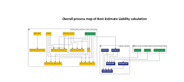
Process maps like this are helpful for reviewers as they show clearly which file and worksheet they need to focus on. As there are lots of components on this process map, number of formula references were removed for easier visual inspection. Over time the process map may become too complex in which case the analyst may decide to simplify by collapsing certain sections to preserve the overview.
Further insights with process mining and Gen AI
Advanced technologies are available to take automation of Excel-based processes to the next level.
First, process mining can be applied on the metadata underlying the process map e.g. by deeper analysis of the process graph (.graphml file). Examples of insights resulting from this exercise include but are not limited to the identification of:
- Non-contributory items (e.g. worksheets not feeding into the results)
- Files containing excessive number of cells or complex formulae slowing down the calculations
- Inconsistent formulae (across rows and columns)
- Critical paths and process bottlenecks
Second, generative AI tools such as ChatGPT, GitHub Copilot or MS Copilot can be used to transform a spreadsheet-based process into program code (e.g. Python or R) resulting in quicker runtime. The same tools can generate test cases to verify the success of the implementation by running the calculation in the original and the new environment.
These models accept Excel file(s) as inputs and generate the code via a prompt. The code usually requires edits and debugging but the AI assistant can still speed up the coding process. Note that:
- The success of such an exercise will depend on how well-structured the process and the underlying Excel spreadsheets are – e.g. this may be difficult to achieve if lots of cell references without clear labels are involved. Diagrams produced through process mapping can help assess this.
- Transforming processes involving lots of external linked files may take a long time and require several iterations.
- You will need to consider data privacy and we suggest avoiding sharing sensitive information with external tools unless it is guaranteed that it will not leave the organisation in any way.
Conclusions
Process mapping is the foundation and starting point of any workflow optimisation project as it helps explore and visualise the components of the current process and identify any bottlenecks.
In this blog post we have shown how process mapping can be automated with a suite of freely available or open-sources tools. We generated charts without even opening the underlying components (Excel files) and gained insights into the flow of information and calculation intensity. This approach can help significantly reduce the time and resources required to perform process mapping and documentation.
Finally, we outlined how advanced technologies such as process mining and generative AI can take this to the next level by extracting further insights from process metadata and replacing a spreadsheet-based process by (Python or R) program code.
In our next post in this series we will cover automated data cleaning and transformations.
How can Finalyse help?
Finalyse supports its clients with pragmatic, tailor-made solutions to solve real-world business problems in the domains of financial reporting, valuations, risk management and pricing often by bridging the gap with IT. We aim to develop trust-based, lasting relationships with our clients. A cooperation in process mapping can be the first step in our journey together.
- Find out more about our approach for process automation for (re)insurers
- Request a complimentary process automation workshop so that we can help identify and prioritise your use cases
Finalyse InsuranceFinalyse offers specialized consulting for insurance and pension sectors, focusing on risk management, actuarial modeling, and regulatory compliance. Their services include Solvency II support, IFRS 17 implementation, and climate risk assessments, ensuring robust frameworks and regulatory alignment for institutions. |

Our Insurance Services
Check out Finalyse Insurance services list that could help your business.
Our Insurance Leaders
Get to know the people behind our services, feel free to ask them any questions.
Client Cases
Read Finalyse client cases regarding our insurance service offer.
Insurance blog articles
Read Finalyse blog articles regarding our insurance service offer.
Trending Services
BMA Regulations
Designed to meet regulatory and strategic requirements of the Actuarial and Risk department
Solvency II
Designed to meet regulatory and strategic requirements of the Actuarial and Risk department.
Outsourced Function Services
Designed to provide cost-efficient and independent assurance to insurance and reinsurance undertakings
Finalyse BankingFinalyse leverages 35+ years of banking expertise to guide you through regulatory challenges with tailored risk solutions. |

Trending Services
AI Fairness Assessment
Designed to help your Risk Management (Validation/AI Team) department in complying with EU AI Act regulatory requirements
CRR3 Validation Toolkit
A tool for banks to validate the implementation of RWA calculations and be better prepared for CRR3 in 2025
FRTB
In 2025, FRTB will become the European norm for Pillar I market risk. Enhanced reporting requirements will also kick in at the start of the year. Are you on track?
Finalyse ValuationValuing complex products is both costly and demanding, requiring quality data, advanced models, and expert support. Finalyse Valuation Services are tailored to client needs, ensuring transparency and ongoing collaboration. Our experts analyse and reconcile counterparty prices to explain and document any differences. |

Trending Services
Independent valuation of OTC and structured products
Helping clients to reconcile price disputes
Value at Risk (VaR) Calculation Service
Save time reviewing the reports instead of producing them yourself
EMIR and SFTR Reporting Services
Helping institutions to cope with reporting-related requirements
CONSENSUS DATA
Be confident about your derivative values with holistic market data at hand
Finalyse PublicationsDiscover Finalyse writings, written for you by our experienced consultants, read whitepapers, our RegBrief and blog articles to stay ahead of the trends in the Banking, Insurance and Managed Services world |

Blog
Finalyse’s take on risk-mitigation techniques and the regulatory requirements that they address
Regulatory Brief
A regularly updated catalogue of key financial policy changes, focusing on risk management, reporting, governance, accounting, and trading
Materials
Read Finalyse whitepapers and research materials on trending subjects
Latest Blog Articles
Contents of a Recovery Plan: What European Insurers Can Learn From the Irish Experience (Part 2 of 2)
Contents of a Recovery Plan: What European Insurers Can Learn From the Irish Experience (Part 1 of 2)
Rethinking 'Risk-Free': Managing the Hidden Risks in Long- and Short-Term Insurance Liabilities
About FinalyseOur aim is to support our clients incorporating changes and innovations in valuation, risk and compliance. We share the ambition to contribute to a sustainable and resilient financial system. Facing these extraordinary challenges is what drives us every day. |
Finalyse CareersUnlock your potential with Finalyse: as risk management pioneers with over 35 years of experience, we provide advisory services and empower clients in making informed decisions. Our mission is to support them in adapting to changes and innovations, contributing to a sustainable and resilient financial system. |

Our Team
Get to know our diverse and multicultural teams, committed to bring new ideas
Why Finalyse
We combine growing fintech expertise, ownership, and a passion for tailored solutions to make a real impact
Career Path
Discover our three business lines and the expert teams delivering smart, reliable support
